Day/Night Theme Toggle
Creating a delightful day/night theme toggle animation
Overview
In the world of modern web design, theme toggles have become a standard feature. However, many implementations feel mechanical and utilitarian, missing an opportunity to create a more meaningful connection with users. This project began with a simple question: How can we transform this everyday interaction into something more engaging and delightful?
Drawing inspiration from Suhad M's beautiful design on Dribbble, I set out to create a toggle that would capture the natural transition between day and night. The goal was to combine smooth animations, subtle lighting effects, and scenic elements to craft an experience that feels both intuitive and magical.
Component Structure
The toggle's architecture is built around three main layers that work together to create the final effect. At its core, we have the basic toggle switch mechanism, which handles the fundamental interaction. This is enhanced by a dynamic glow effect that simulates natural lighting, and finally, we have the background scenes that provide context and depth to the experience.
Each layer serves both a functional and aesthetic purpose. The toggle switch provides clear feedback about the current state, the glow effect adds warmth and dimensionality, and the background scenes help users instantly recognize the current theme while adding a touch of whimsy to the interface.
The Animation Magic
The smooth, natural feel of the toggle comes from carefully choreographed animations that work in concert. The transition between states isn't just a simple switch—it's a coordinated dance of multiple elements that creates a sense of depth and dimension.
Let's break down the key animation components that bring this toggle to life:
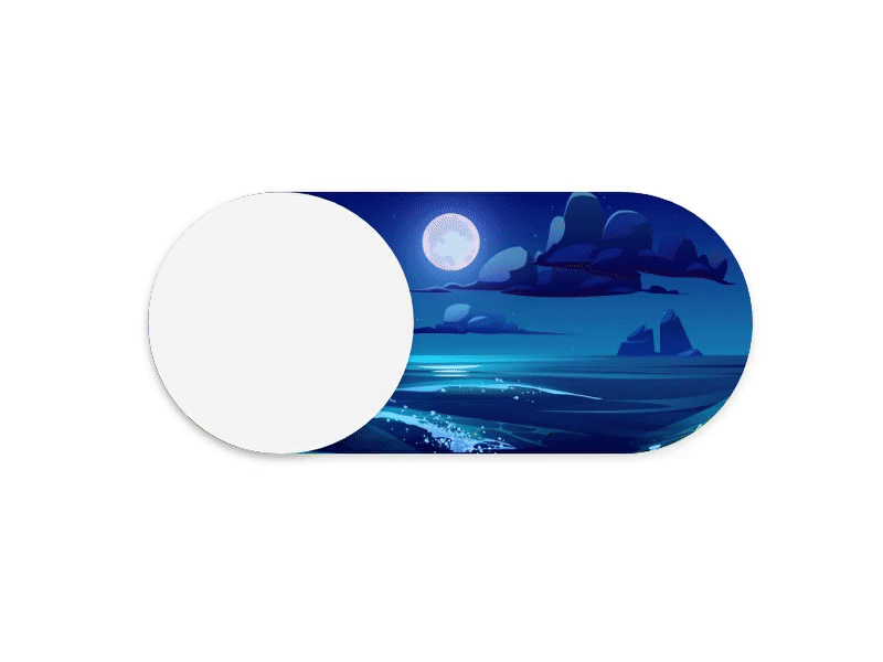
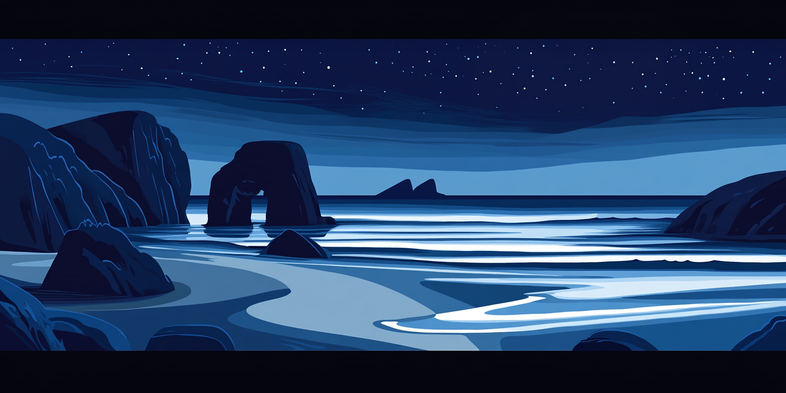
Background Scenes
The background scenes are more than just decorative elements—they're vital storytelling components that help users instantly understand the current theme state. Each scene was carefully crafted to create a distinct mood while maintaining visual harmony with the overall design.

Accessibility Considerations
While creating an aesthetically pleasing toggle was important, ensuring it remains accessible to all users was paramount. The toggle incorporates several key accessibility features that make it both beautiful and functional for everyone:
The toggle uses ARIA labels that dynamically update to reflect the current theme state, ensuring screen readers can accurately convey the toggle's purpose and status. Keyboard navigation is fully supported, allowing users to toggle themes using either the space bar or enter key. The design maintains high contrast ratios in both themes, and includes multiple visual indicators beyond color to convey state changes.
Conclusion
This project demonstrates how attention to detail and thoughtful animation can transform a simple utility into a delightful user experience. By considering both the functional and emotional aspects of the interaction, we've created a toggle that not only serves its primary purpose but also adds a moment of joy to the user's journey.
The combination of smooth animations, carefully crafted scenes, and proper accessibility considerations shows that practical functionality and engaging design aren't mutually exclusive—they can work together to create something both useful and delightful.
Try It Yourself
Experience the toggle yourself! Click or use keyboard navigation to switch between light and dark themes.